Where does Generation I end and Generation II begin?
This seems like a simple question. Most (if not all) Pokémon fans run on the logical assumption that the second “generation” of Pokémon started with Gold and Silver, but the actual answer to the question is much more convoluted – the two generations seem to be significantly intertwined.
To no one’s surprise, new evidence about the timeline of Pokémon’s development emerged from within the Spaceworld 1997 demos for Gold and Silver. These prototypes branched off from the games’ main development some time during or before November of 1997, pre-dating Yellow Version by a year and the final Gold and Silver by a solid two years. While the demo was somewhat altered and abridged from the full games in development, it is overall a revealing snapshot of how progress on the games had been coming along at that point in time.
Instead of the 100 new Pokémon designs included in the ROM that the world has been abuzz over, today’s article focuses on the sprites of the original 151 – there’s something odd about them that might pique the interest of those who have been paying attention to the way that Game Freak approached ‘official’ or ‘canonical’ designs for monsters back in the day. In other words – do you like Sugimori art?
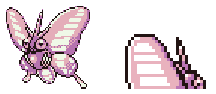
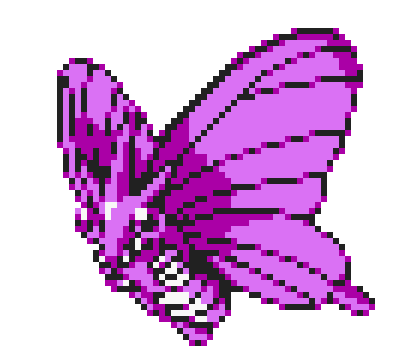
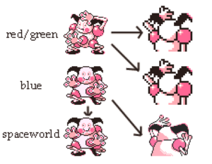
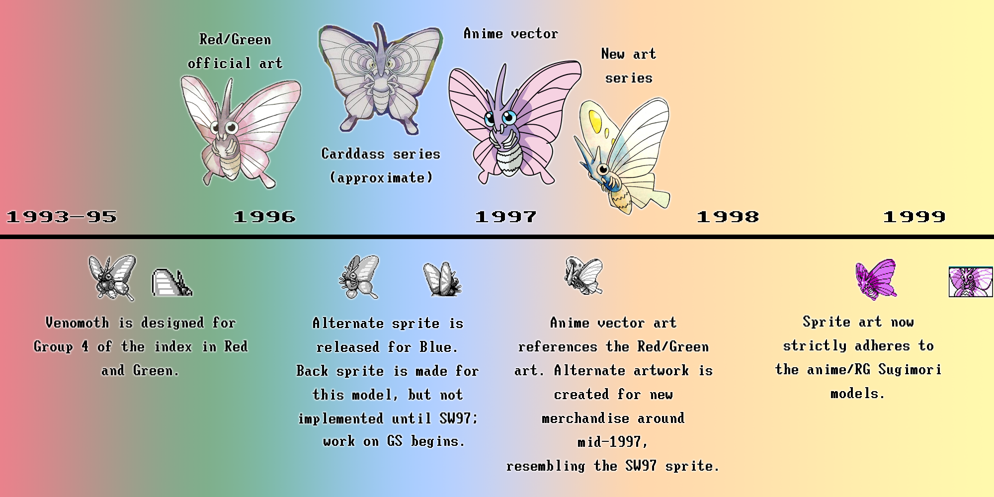
The Pokémon with the most compelling evidence is Venomoth, whose appearance was altered further and improved upon after its debut in Red and Green. Here are its sprites from Red and Green (February 1996).
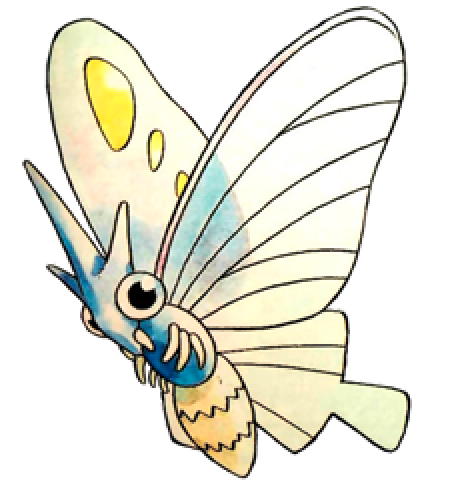
Additionally, here is Ken Sugimori’s design for it dating from Red and Green’s release.
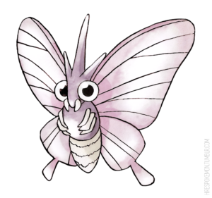
Sugimori’s alterations to the design are minor and mostly boil down to stylistic differences and the technical limitations of the Game Boy.
In Blue, the front sprite was given an alternate pose, but the back sprite was left the same as in Red and Green. Blue’s sprite was probably done by the same artist that created the original one.
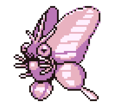
Normally when discussing the development of Pokémon sprites, we continue on to Yellow and then to Generation II. Here’s the sprite from Yellow:
By 1998, Venomoth’s design has been cemented as what Sugimori had envisioned for it when he drew the initial art for Red and Green. The advent of the anime and the insane amount of merchandise made it necessary to have a standard appearance for every Pokémon, based off of (and often directly referenced from) Sugimori’s art. This sprite was probably not drawn by the original creator of Venomoth, either – the art staff for Yellow included some new faces.
This is all just a review of what we’ve taken for granted, though. The Spaceworld 1997 demo threw a spanner into the works: it’s a marked milestone in between late 1996 and late 1998 (when Yellow Version was released).
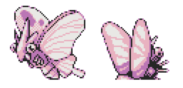
These are the sprites for Venomoth as seen in the Spaceworld demo.
The front sprite has a similar pose and appearance to Venomoth’s art in a second set of Pokémon art that Sugimori made. These designs began to be released on merchandise such as stamps and stickers around mid-to-late 1997. They’re often called art from Blue Version, or Red and Blue, but in truth this art series probably had some back-and-forth with the then-in-progress Pokémon 2. Many of the front sprites in the demo are fairly close to their final Gold sprites, as well.
Now, about the Spaceworld back sprite….. Looks familiar, right? The back sprite resembles Venomoth’s original design that comes from Red and Green, except that it’s a unique sprite, and not copied over from Blue Version, like several of the front sprites in the Spaceworld demo happen to be. The same can be said for several other Pokémon with differences in design, like Gastly, Sandshrew, and Porygon.
 Unlike Generation 1’s back sprites, the pixels have not been enlarged to imply perspective. This allows for more detail in Gold and Silver’s back sprites. What’s really important here is that these specific back sprites still possess the older designs from Red/Green/Blue. They contrast with the newer front sprites, which are closer to those of final Gold and Silver (but in the original Game Boy style).
So what does this mean, exactly? Let’s break down what has been covered:
![]() The back sprites were created for a larger template than that of Red, Green, and Blue.
The back sprites were created for a larger template than that of Red, Green, and Blue.
![]() The sprites had to have been created at an earlier point than several of the front sprites in the Spaceworld demo, since the monster designs are inconsistent between back and front.
The sprites had to have been created at an earlier point than several of the front sprites in the Spaceworld demo, since the monster designs are inconsistent between back and front.
![]() Our “snapshot” of GS’s development, the Spaceworld demo, shows that only some of the Pokémon had been given newer front sprites by the fall of 1997. Many of them still had their front sprites from Blue Version, but all of the back sprites were new.
Our “snapshot” of GS’s development, the Spaceworld demo, shows that only some of the Pokémon had been given newer front sprites by the fall of 1997. Many of them still had their front sprites from Blue Version, but all of the back sprites were new.
![]() The last time that the old Pokémon designs were used in a fully released game were in Blue Version, in October of 1996.
The last time that the old Pokémon designs were used in a fully released game were in Blue Version, in October of 1996.
In a broader context:
Pokémon 2 (later Gold and Silver) started development fairly soon after Game Freak released Red and Green, most likely before starting work on Blue.
Blue Version was originally a special, promotional, and exclusive game for CoroCoro Comic magazine subscribers that was developed in conjunction with Gold and Silver during 1996. Work probably began on it once Pokémon’s popularity was well-established.
Notably, Blue’s development is eclipsed at both ends by that of Pokémon 2, and both of these games were most likely built off of Red and Green out of the gate – Blue is an optimized version of the first two games, and the Spaceworld demo reuses a significant amount of Red and Green’s data.
When this timeline is combined with the sprite information from Spaceworld 97, we can hypothesize that the new sprites created for Blue Version were, in fact, originally meant for Pokémon 2, and only used for Blue once it began development. It would make sense, right? Imagine the situation at Game Freak: “Oh, hey, we need a special edition of a Pokémon game.” “Well, we do have alternate sprites for every Pokemon… let’s just use these.” But since Blue is just an offshoot of Red and Green (or perhaps even an offshoot of a very early Pokémon 2 itself), it would be impossible to implement the new, larger back sprites without significantly altering the code; all this while racing against the game’s deadline, too. Alternatively, the back sprites could have also been made some time after Blue’s release, when the sprites were still the newest ones. Regardless of the true reasons, Blue was left with the original back sprites, while Pokémon 2 continued to use the new ones.
As an example, here’s a comparison using Mr. Mime’s sprite. Mr. Mime still had its Blue sprite in Spaceworld, and it’s easy to see that the new back sprite was intended to match the Blue sprite’s pose.
Some time after Blue’s release, the anime and other Pokémon adaptations started to reflect back on Game Freak, and they began to redesign the “Blue” sprites one by one to be more consistent with the models. They were definitely not done by Spaceworld, seeing as a significant portion of Generation I Pokémon still used the sprites from Blue for the demo. In Venomoth’s case, there are still some design differences from its anime/final design, like its spots. With these circumstances, we can’t really put a specific time stamp on when these intermediary sprites were made, but we can infer as to what influenced the updates to the sprites in the first place.
Here is a full timeline for ol’ Venomoth.
Sources
![]() All sprites and art are from TCRF’s page on the Spaceworld demo (and thus taken directly from Team Spaceworld), Bulbapedia, and The Spriter’s Resource.
All sprites and art are from TCRF’s page on the Spaceworld demo (and thus taken directly from Team Spaceworld), Bulbapedia, and The Spriter’s Resource.
Thanks for reading! Here’s hoping we can unravel more Pokémon mysteries in the future…
This is so thoughtful and interesting! I’m glad I stumbled upon this website.
Solid historical inferences here. I find that Poké-primordial period before the anime/merchandise blitz standardized the monster designs fascinating, and am very grateful for this site’s work in investigating this niche subject!
I am just starting to explore the site now, but have you speculated on the particular identities of the various sprite artists who worked on the first two generations of the games, and how their work might be attributed?
Yes of course we did. It’s pretty much confirmed that for Red and Green the sprite artists were Sugimori, Morimoto, Fujiwara and Nishida. Unfortunately not all the sprites can be attributed since some of them are hastily re-scaled and another bunch has been probably reworked by more than one hand 😀 thanks for visiting! Cheers!
There’s an old fan-theory that notes Butterfree looks much more like a Venonat evolution, and Venomoth looks a little like a Caterpie-Metapod evolution with the three-pointed top and round eyes.
This doesn’t match the internal Pokemon numbers, which have Caterpie-Metapod-Butterfree all together, but it’s plausible that sprites were switched at some point. Venomoth is close to the Caterpie in the late internal numbers, whereas Venonat was an isolated early entry. I’ve always wondered if the Buttefree/Venomoth swap was deliberate.
That is insane!! I’m looking now. Kakuna would have been a great example to show as well, with the Spaceworld front sprite having its “Arms” stock to it’s body, while the Arms stick out in it’s back sprite, exactly like the sprites in Blue.
I wonder if the Yellow sprites also had unique back sprites that will ever see the light of day.
So, the leaks happened and it’s been confirmed that Pokémon Blue was spun off Gold and Silver, not R/G. So that’s cool.